Layout system
Building an extensible system to power the whiteboard UI
Staff designer
2021
UI/UX, UXR, Motion, Prototyping
Miro
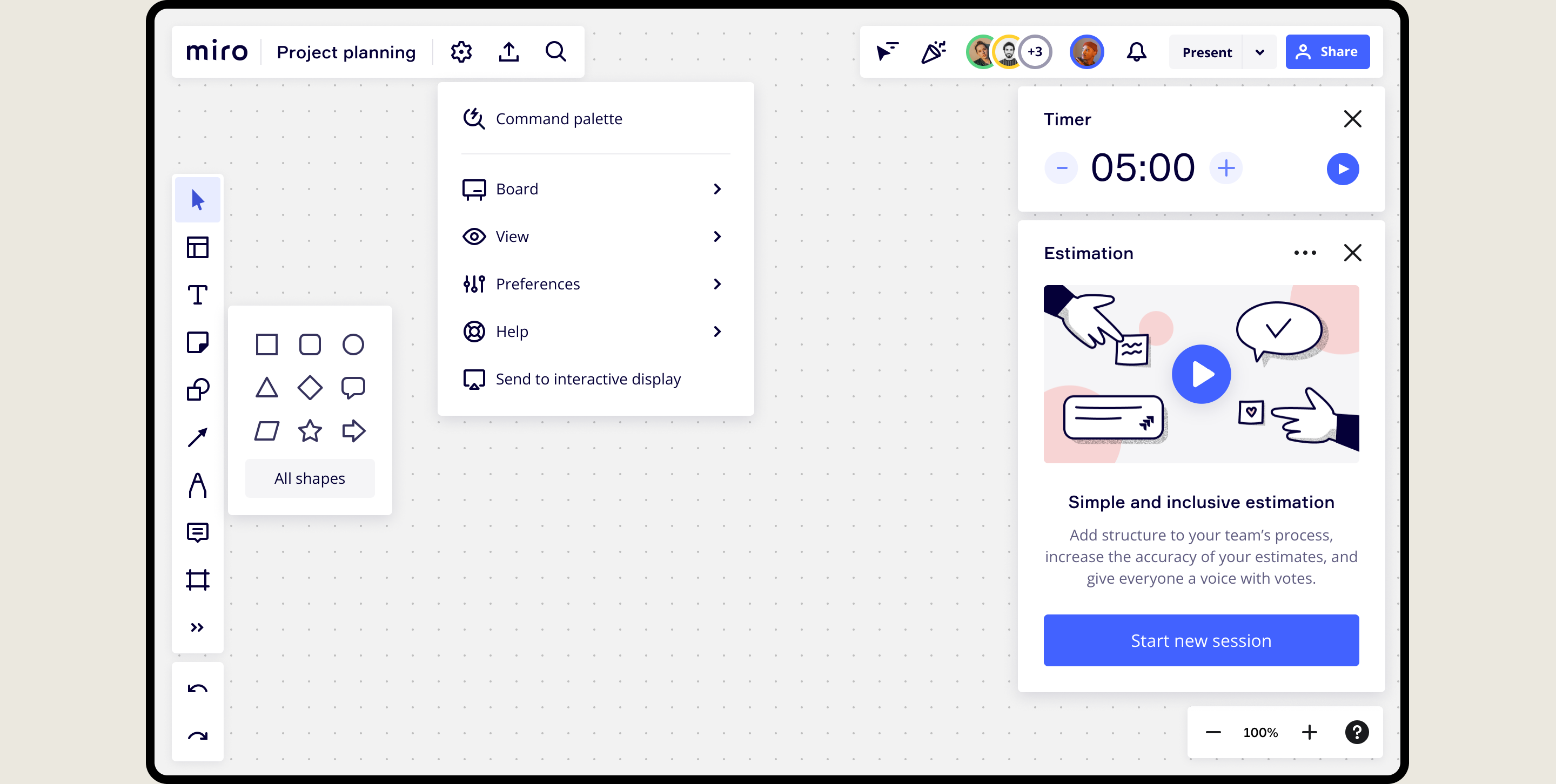
During the rapid growth, Miro had accumulated a lot of new features. The main interface had become cluttered and overwhelming, with toolbars crammed full of buttons. Space for new features was scarce, causing friction between product teams. Teams were frustrated as they couldn't achieve the desired visibility for their newly developed features. The board UI was also hard to extend, leading teams to use hacky and inconsistent solutions.
To declutter the interface, I moved less frequently used features to secondary menus, creating a cleaner, more focused user experience. I designed a new, scalable layout system that is easy to extend by internal teams and external plugin developers. The system includes panel components and extension points, while also enabling features like pinning and toolbar customization. I also designed a command palette that provides fast access to all Miro features directly from the keyboard.
Layout panels
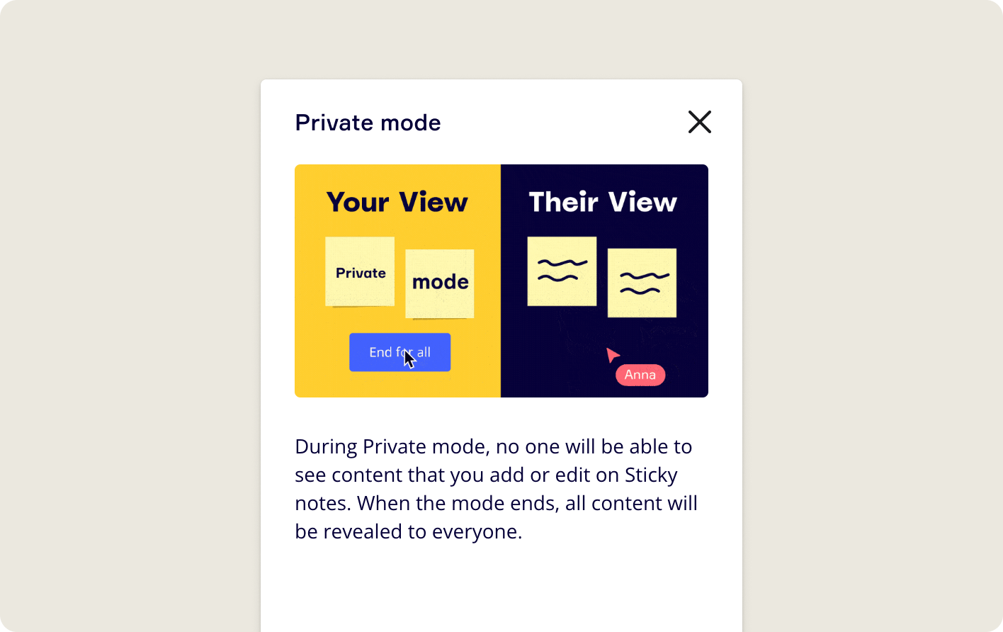
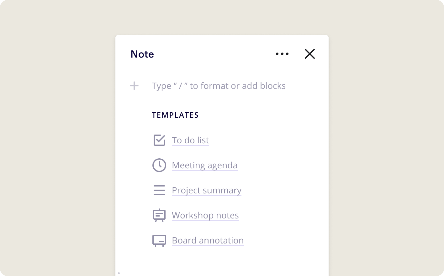
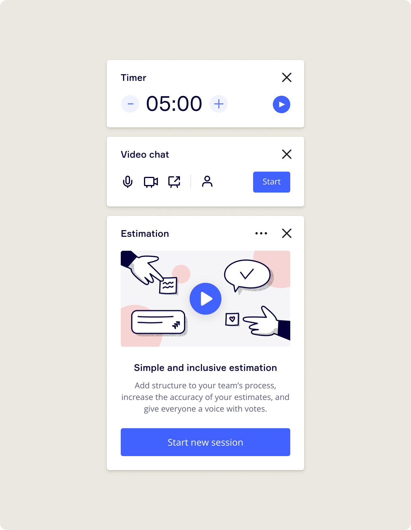
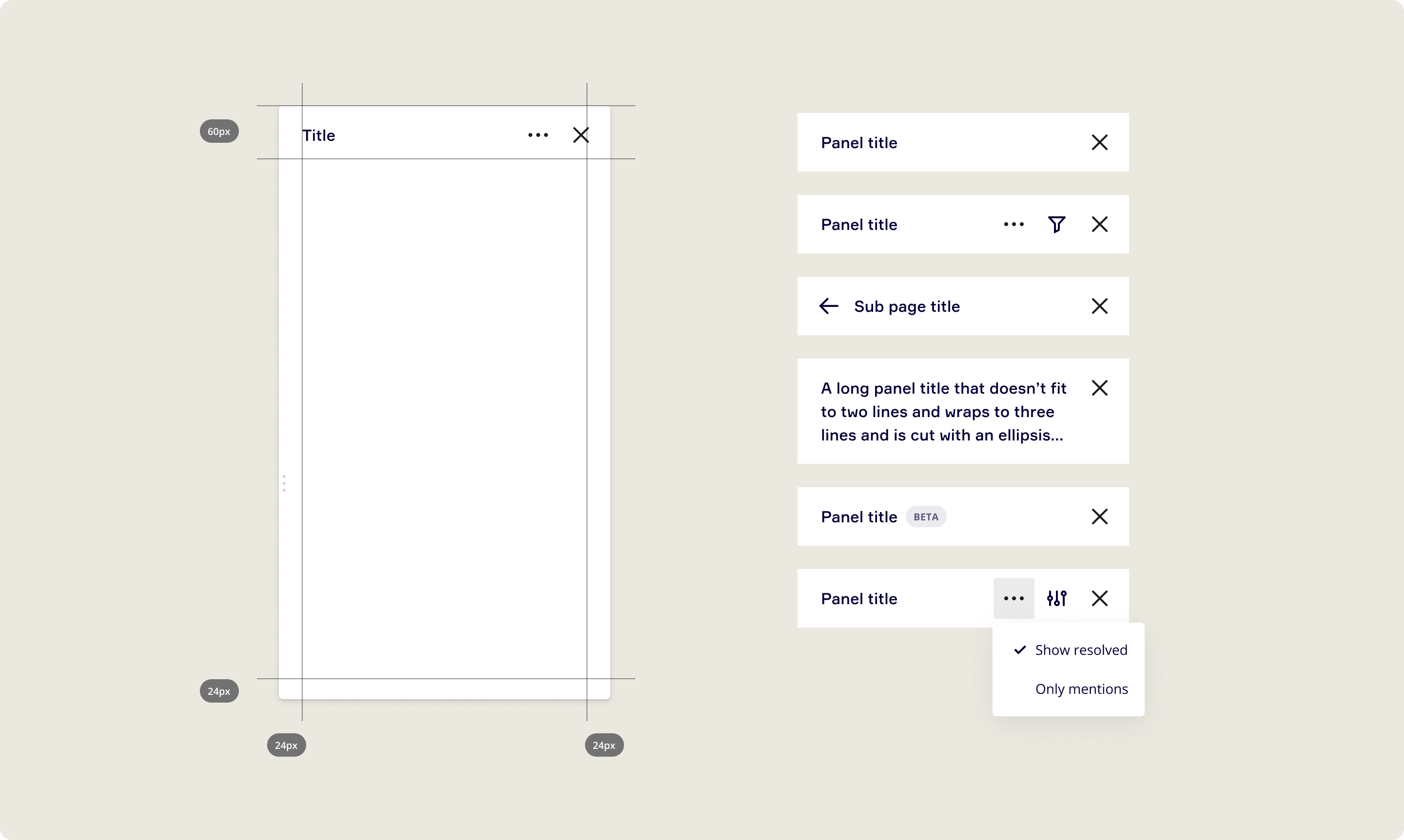
Miro didn’t have a robust, easy to use panel component which led product teams to extend Miro layout with hacky and inconsistent solutions. Working closely with our developers, I designed a new panel component for internal teams and third party developers. The new panel component has consistent styling and can be configured to many different use cases.
New loading animation and skeleton loader
Miro underwent a rebranding, which meant that the loading experience needed redesign. I designed a new logo animation and a skeleton loader that appears immediately when opening a board, giving an impression of faster loading speed. I coded the animation with CSS because it was the only way to ensure the animation would run smoothly on the GPU and load instantly.
Drag and drop pinning
In Miro, how panels opened was inconsistent - some tool panels closed when a user clicked the canvas outside of them, and some panels did not. There was no way to control which panels stayed visible and which ones closed automatically. To make the experience more predictable and to give users more freedom, I designed a new panel pinning behavior that allows users to drag panels to pin them to three possible locations.
Panel stacking
I designed a new panel stacking system so that users can multitask by keeping multiple tool panels open at the same time. The old system was confusing and broke down when several panels were opened. I also build a fully working react prototype to test how the new new system would work in practice.
Responsive toolbars
The toolbars in Miro need to scale to wide range of devices from large interactive displays to small tablets. The toolbar scaling logic needed a redesign because we had added many new features to the top toolbar area, making the toolbars ineffective for smaller devices. I conducted a user test to understand which features users preferred to have a direct access to as the screen size gets smaller. Based on the insights, I designed and prototyped a new toolbar scaling logic that gradually collapses the toolbars while prioritising the most important entry points.
Main menu
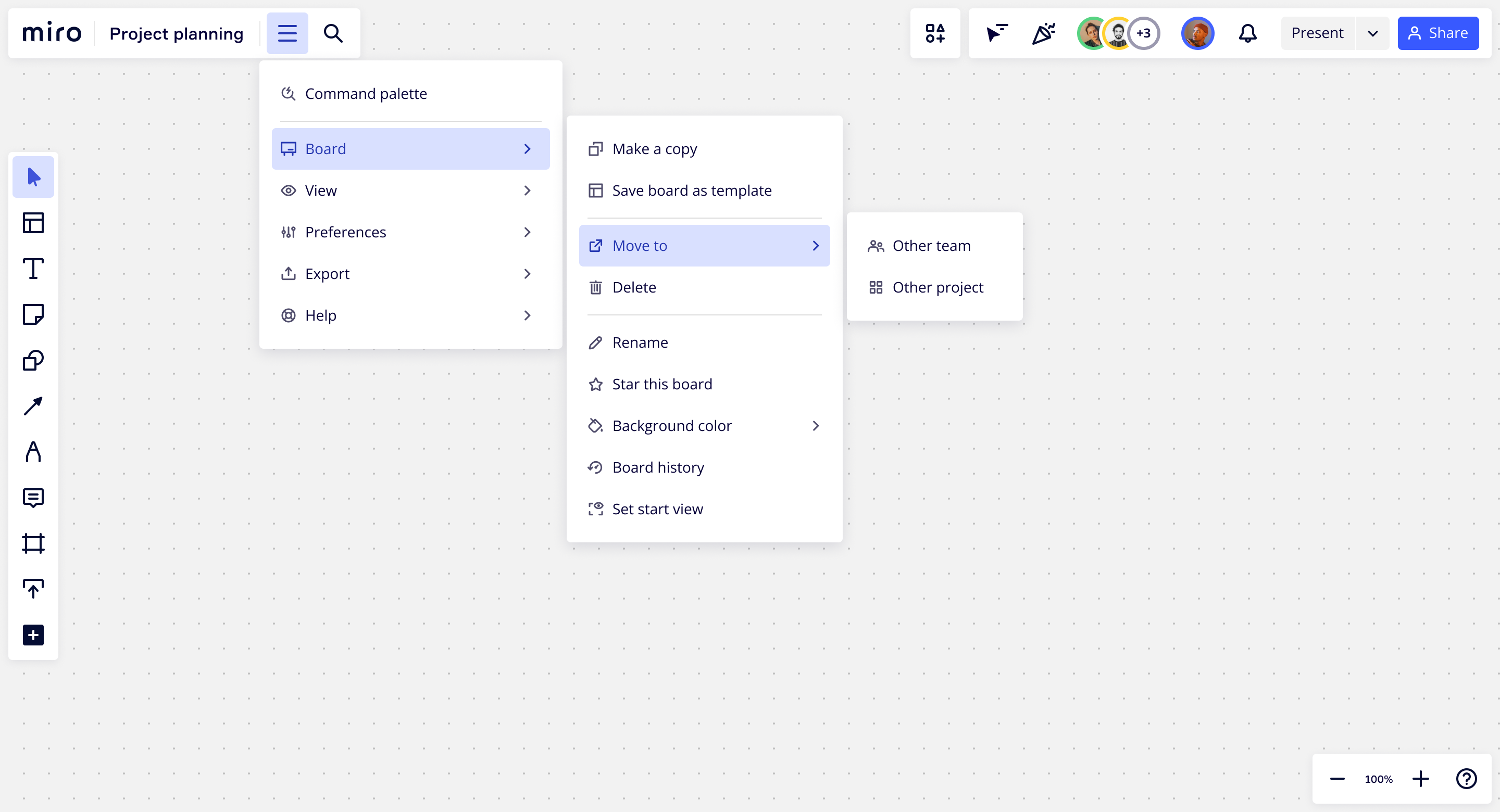
We wanted to make the top level of the UI less overwhelming by moving features that are used less to a different location. However, the issue was that there wasn't a suitable place for these features. My solution was to create a new main menu that contains all the less used features and settings in an easily scannable format.
Command menu for power users
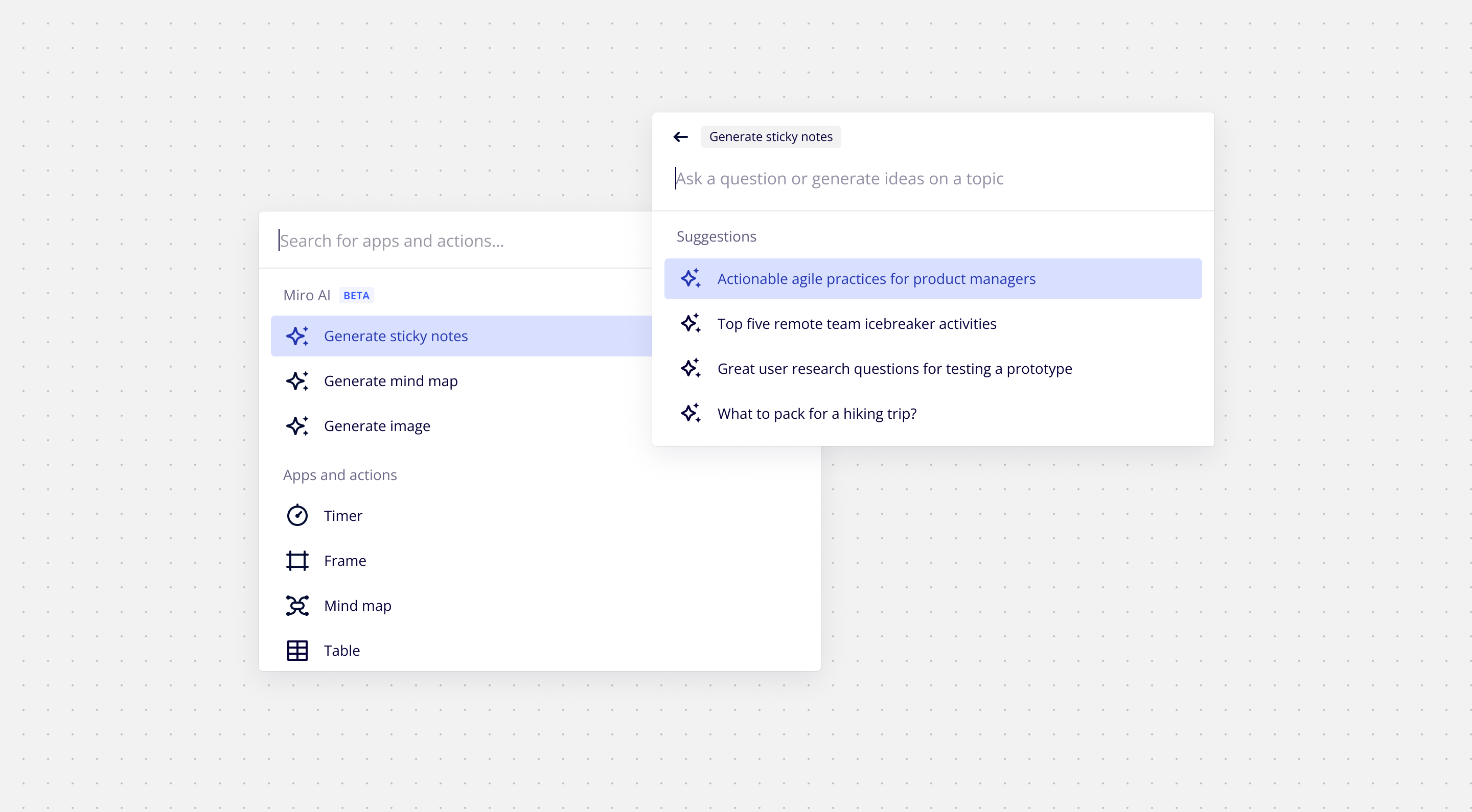
The command menu is a text-based interface that lets power users control Miro directly from the keyboard. By pressing CMD+K, the command menu appears, allowing users to quickly launch tools, commands, and find settings and templates. Its default state offers quick access to recently used commands. The menu also supports subpages for more advanced features, like generative AI. The vision is to turn the command menu into a 'search everything' interface by expanding the search to include visual assets like emojis, stickers, and shapes.
Guiding principles
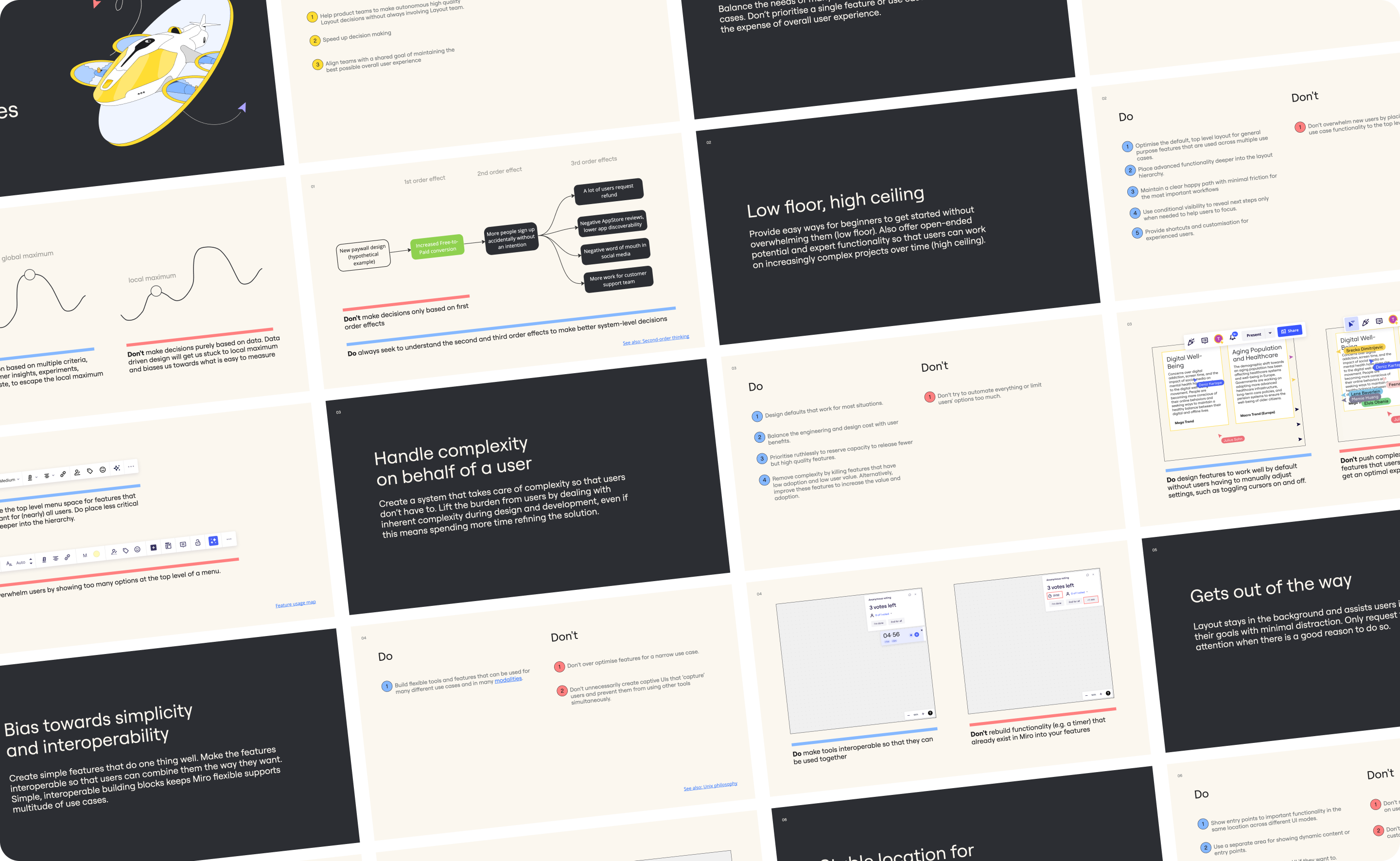
Choosing the best way to add new features to the layout wasn't straightforward. There was tension between teams because there wasn't enough space to fit everything at the top level. Moreover, product teams were motivated to prioritise their features, often at the expense of the overall user experience. To address these issues, I wrote guiding principles to speed up decision-making. These principles help product teams make high-quality decisions and align them with the shared goal of maintaining the best possible overall user experience.
Outcome
- A set of building blocks that enables internal and third-party teams to easily extend the Miro layout with consistent look and feel.
- A panel and toolbar system scales to all screen sizes and supports multitasking and customisation
- A set of guiding principles to held other product teams to make faster system level product decisions
- Smoother loading experience and CSS based logo animation that is user across the Miro product